Advanced Typography- Task 1/ Exercises: Typographic Systems & Type & Play
30.8.2023-13.9.2023/ Week 1- Week 3
Kelly Lau Jie Ning/ 0354839
Advanced Typography/ Bachelor of Design (Honours) in Creative Media

2. Radial System: All elements are extended from a point of focus.

3. Dilatational System: All elements expand from a central point in a circular
fashion.


5. Grid System: A system of vertical and horizontal divisions.

6. Transitional System: An informal system of layered banding.


-In reaction to this very ordered approach to the Typography of the modernist
era, a group of younger designers began to question and challenge this notion
of order.
Kelly Lau Jie Ning/ 0354839
Advanced Typography/ Bachelor of Design (Honours) in Creative Media
Task 1/ Exercises: Typographic Systems & Type & Play
LECTURES
Week 1-Typographic Sytems
-The typographic systems are akin to what architects term shape
grammars.
-The typographic systems are similar in that the systems have a set of
rules that are unique and provide a sense of the purpose that focuses and
directs the decision-making.
1. Axial System: all elements are organised to the left or right of a single
axis.

Fig 1.1 Axial system
2. Radial System: All elements are extended from a point of focus.

Fig 1.2 Radial system

Fig 1.3 Dilatational system
4. Random System: Elements appear to have no specific pattern or relationship.

Fig 1.4 Random system

Fig 1.5 Grid system
Fig 1.6 Transitional system
7. Modular System: A series of non-objective elements that are constructed
as a standardised unit.

Fig 1.7 Modular System
8. Bilateral System: All text is arranged symmetrically on a single axis.

Fig 1.8 Bilateral System
Week 2- Typographic Composition
Principles of Design Composition
-we think about the dominant principles underpinning design composition
(emphasis, isolation, repetition, symmetry and asymmetry, alignment,
perspective)
-However, these abstract notions seem ambiguous when it comes to translating
them into typographic layouts or composition.
-They seem more relevant to imagery than complex units of information that
consist of different elements.

Fig 2.1 Principle of design- Emphasis
The Rule of Thirds
-basically suggests that a frame (space) can be divided into 3 columns and 3
rows.
-The interesting lines are used as a guide to place the points of interest,
within the given space.

Fig 2.2 The rule of thirds
Typographic Systems
-From these 8 systems the most pragmatic and most used system is the Grid
System.

Fig 2.3 Grid system
-There was a method to their madness.
-Order was replaced with apparent chaos but this chaos was exciting and 'new'
for a new generation that was being exposed to Punk anti-establishment thought
and music.


Fig 2.4 Left to right: Paula Scher, Jonathan Barnbrook and David Carson
Environmental Grid (Other models/ Systems)
-This system is based on the exploration of an existing structure or
numerous structures combined.
-An extraction of crucial lines both curved and straight are formed.

Fig 2.5 Environment Grid
Form and Movement (Other models/ Systems)
-The placement of a form (irrespective of what it is) on a page, over many
pages creates movement.

Fig 2.6 Examples of Form and Movement
Week 3- Context and Creativity


3. Early Greek (5th C. B.C.E.)
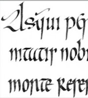
Handwriting
-basis or standard for form, spacing and conventions of mechanical type
would try and mimic
-The shape and line of hand-drawn letterforms are influenced by the
tools and materials used to make them.
-Sharpened bones, charcoal sticks, plant stems, brushes, feathers and
steel pens all contributed to the unique characteristics of the
letterform.


Fig 3.1 Evolution of the Latin Alphabet
1. Cuneiform (c. 3000 B.C.E.)
-the earliest system of actual writing
-used in a number of languages between the 34C. B.C.E through the 1st
century C.E

Fig 3.2 Cuneiform
2. Hieroglyphics (2613-2160 B.C.E)
-The Egyptian writing system is fused with the art of relief carving.
-used as ideograms to represent the things they actually depict.
-used as determinatives to show that the signs preceding are meant as
phonograms and to indicate the general idea of the word.
-used as phonograms to represent sounds that 'spell out' individual
words.

Fig 3.3 Hieroglyphics

Fig 3.4 Early Greek
4. Roman Unicials

Fig 3.5 Roman Unicials
5. English Half Unicials (8th C.)


Indus Valley Civilization (IVC) script (3500-2000 BCE)


Construction and considerations:

Week 5- Perception & Organisation


Weight


After resizing the letterform, I adjusted the letterform. The letters J
and K are fine so I just adjusted the letters M, N, and A

Identifying a reference


Fig 3.6 English Half Unicials
6. Carolingian Minuscule

Fig 3.7 Carolingian Minuscule
7. Black letter (12-15 C. CE)
Fig 3.8 Black letter
8. Movable Type (11C.-14C.)
Fig 3.9 Movable Type
Evolution of Middle Eastern Alphabets-Use of sound represented in letters
-the script itself has been possibly influenced by the Egyptian
Hieroglyphics and Hieratic Scripts.

Evolution of Chinese Script

Fig 3.10 Evolution of Eastern Alphabets
-From the Oracle bone to Seal Script to Clerical Script, Traditional and
Simplified scripts.

Fig 3.11 Evolution of Chinese Script
-Oldest writing found in 'Indian'

Fig 3.12 Indus Valley Civilization script
Brahmi script (450-350 BCE)
-Earliest writing system developed in India after the Indus script

Fig 3.13 Brahmi script
Week 4- Designing Type
Why design another typeface?
-type design carries a social responsibility so one must continue to
improve its legibility
-type design is a form of artistic expression
General Process of Type Design:
1. Research
-understand type history, type anatomy, and type conventions
-know terminologies, side-bearing, metrics, hinting...
-determine the type's purpose
-examine existing fonts that are presently being used for
inspiration/ideas/references/context/usage pattern
2. Sketching
-use traditional tool set (brushes/pens, ink and paper)
-use digital tool sets, such as Wacom directly into a font design
software
3. Digitization
-FontLab and Glyphs App
-Some designers also use Adobe Illustrator to design or craft the
letterforms and then introduce it into specialized font apps.
-Attention should not only be given to the whole form at this stage but
also to the counter form
4. Testing
-the result of the testing is part of the process of refining and
correcting aspects of the typeface
-Prototyping- part of the testing process and leads to important
feedback
5. Deploy
-Avoid teething problems that did not come to the fore during the
prototyping and testing phases
-The rigour of the testing is important so that the teething issue
remains minor
Typeface Construction:
-using grids (with circular forms) can facilitate the construction of
letterforms and is a possible method to build/create/design your
letterform

Fig 4.1 Construction grid for the Roman Capital
-An important visual correction is the extrusion of curved (and
protruding) forms past the baseline and cap line
-applies to vertical alignment between curved and straight forms
-The letters must be altered to a uniform 'visual' white space
-This means that the white space between the letters should appear the
same- 'fitting'

Fig 4,2 Classification according to form and construction
-the way in which something is regarded, understood, or interpreted
-Perception in typography deals with the visual navigation and
interpretation of the reader via contrast, form and organisation

Fig 5.1 Example of contrast
ContrastSize
-make us see the bigger letter first when a big letter and a small
letter are having at the same time

Fig 5.2 Contrast of size
-The bold type stands out in the middle of the lighter type of the same
style
-using bold, using rules, spots, and squares provides a "heavy area" for
a powerful point of visual attraction or emphasis

Fig 5.3 Contrast of weight
Form
-distinction between a capital letter and its lowercase equivalent
-Roman letter and its italic variant
-condensed and expanded versions of the typeface


Direction


Fig 5.4 Contrast of form
Structure
-Different letterforms of different kinds of typefaces

Fig 5.5 Contrast of structure
Texture
-the way the lines of type look as a whole up close and from a distance

Fig 5.6 Contrast of texture
-opposition between vertical and horizontal, and the angles in
between
-turning one word on its side
-text blocks
-mixing wide blocks of long lines with tall columns of short line

Fig 5.7 Contrast of direction
Colour
-The use of colour suggests that a second colour is often less emphatic
in values than plain black-on-white
-important to give thought to which element needs to be emphasized and
to pay attention to the tone values of the colors that are used

Fig 5.8 Contrast of colour
Form
-Part that plays a role in visual impact and first impressions
-to represent a concept
-to do so in a visual form

Fig 5.9 Form
-The interplay of meaning and form brings a balanced harmony both in terms
of function and expressionOrganisation / Gestalt
-the way a thing has been "placed" or "put together"
-in design, the components/ elements that make up the design are only as
good as its overall visual form
-The Law of similarity- states that elements that are similar to each
other tend to be perceived as a unified group

Fig 5.10 similarity
-The Law of Proximity- states elements that are close together tend to
be perceived as a unified group

Fig 5.11 Proximity
-The Law of Closure- refers to the mind's tendency to see complete figures
or forms even of a picture is incomplete, partially hidden by other
objects, or if part of the information needed to make a complete picture
in our minds is missing

Fig 5.12 Closure
The law of (Good) Continuation- holds that humans tend to perceive each of
two or more objects as different, singular, and uninterrupted objects even
when they intersect.


Final outcome-Exercise 1:Typograhic Systems


Finding the letter

Extracted Letterform

Fig 5.13 Continuation
-The Law of Symmetry
Law of Praganz
INSTRUCTIONS
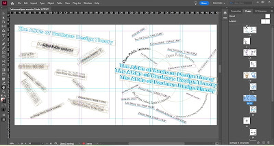
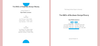
Exercises 1: Typograhic System
What we need to do for our first task is we need to create 8 types
of Typographic systems which are axial, radial, dilational, random,
grid, modular, transitional, and bilateral.
The 8 systems mentioned above are to be explored using the
the following content:
The Design School,
Taylor’s University
All Ripped Up: Punk Influences on Design
or
The ABCs of Bauhaus Design Theory
or
Russian Constructivism and Graphic Design
Open Public Lectures:
June 24, 2021
Lew Pik Svonn, 9AM-10AM
Ezrena Mohd., 10AM-11AM
Suzy Sulaiman, 11AM-12PM
June 25, 2021
Lim Whay Yin, 9AM-10AM
Fahmi Reza, 10AM-11AM
Manish Acharia, 11AM-12PM
The exercise task is to be done using Adobe InDesign only. Size
200 x 200 mm. In addition to black, you can use one other color.
Graphical elements (line, dot, etc.) can be used but limitedly.
Week 1
Axis System:
I have come out with two designs for the axis system
Progress:

Fig 6.1 Progress of axis system, week 1(31.8.2023)

Fig 6.2 Version 1 VS Version 2, week 1 (31.8.2023)
Radial system:
For the radial system, I have also tried to create two different
versions of the design.
Progress:

Fig 6.3 Progress of radial system, week 1 (31.8.2023)

Fig 6.4 Version 1 VS Version 2, week 1 (31.8.2023)
Dilatitional system
Progress:

Fig 6.5 Progress of Dilatitional system, week 1 (31.8.2023)

Fig 6.6 Version 1 VS Version 2, week 1 (31.8.2023)
Random System
Progress:

Fig 6.7 Progress of Random System, week 1 (31.8.2023)

Fig 6.8 Version 1 VS Version 2, week 1 (31.8.2023)
Grid System
Process:

Fig 6.9 Progress of Grid System, week 1 (31.8.2023)

Fig 6.10 Version 1, week 1 (31.8.2023)
Transitional System
Process:


Fig 6.11 Progress of Transitional System, week 1 (31.8.2023)

Fig 6.12 Version 1, week 1 (31.8.2023)
Modular System
Process:
Process:

Fig 6.13 Progress of Modular System, week 1 (31.8.2023)

Fig 6.14 Version 1, week 1 (31.8.2023)
Bilateral System
Process:


Fig 6.15 Progress of Bilateral System, week 1 (31.8.2023)

Fig 6.16 Version 1 VS Version 2, week 1 (31.8.2023)

Fig 6.17 final outcome (axis system)- JPG, week 1 (31.8.2023)

Fig 6.18 final outcome (radial system)- JPG, week 1 (31.8.2023)

Fig 6.19 final outcome (dilatational system)- JPG, week 1
(31.8.2023)


Fig 6.23 final outcome (modular system)- JPG, week 1 (31.8.2023)

Fig 6.24 final outcome (bilateral system)- JPG, week 1 (31.8.2023)
Fig 6.25 Final outcome (without grid) -PDF, week 1( 31.8.2023
Fig 6.26 Final outcome (with grid) -PDF, week 1( 31.8.2023)
Exercises 2A: Type and Play
We need to choose a photo and find the hidden letter from the photo.
Then, we need to refine those letter
Choose photo
The photo I chose is the photo of the chopped wood

Fig 7.1 photo of chopped wood, week 2 (10.9.2023)
I have used the iPad to crop out the wood to find the letter more easily

Fig 7.2 Progress of cropping out the wood, week 2 (10.92023)
I try to resize each letterform
Fig 7.3 letterform after resize, week 2 (10.9.2023)
Fig 7.4 letterform after adjust angle, week 2 (10.9.2023)
The structure I chose is chopped wood so for reference I tried to
choose the letterform to look bold. Then, I found my reference which
is Little One from Google Fonts.
Fig 7.5 Little One
Refining letterforms
I have refined the letterform using 4 steps. From the latest step, I
tried to add on some identity of the wood which are the cracks to make
those letters look like found in the wood.

Fig 7.6 Progress of refining the letterform, week 2 (10.9.2023)
Final Outcome
Fig 7.7 Image of chopped wood-JPG, week 2(10.9.2023)


Fig 7.8 Extracted Letterform on the baseline- JPG, week 2 (10.9.2023)

Fig 7.9 Reference font (Little One)- JPG, week 2 (10.9.2023)


Fig 7.10 Final letterforms on the baseline- JPG, week 2(10.9.2023)

Fig 7.11 The final letter"M"-JPG, week 2 (10.9.2023)

Fig 7.12 The final letter"N"-JPG, week 2 (10.9.2023)

Fig 7.13 The final letter"A"-JPG, week 2 (10.9.2023)

Fig 7.14 The final letter"J"-JPG, week 2 (10.9.2023)

Fig 7.15 The final letter"K"-JPG, week 2 (10.9.2023)

Fig 7.16 Original extraction and final letterforms next to each
other- JPG, week 2 (10.9.2023)
Fig 7.17 Final type Design- PDF, week 2 (10.9.2023)
Exercise 2B: Type and play (Poster)
In this exercise, we need to use the letterforms that we created
previous exercise to make a movie poster.
The background image that I chose:

I try to crop it out and adjust the color in the Photoshop

Fig 8.1 background photo, week 3 (15.9,2023)

Fig 8.2 Progress in the Photoshop, week 3 (15.9.2023)

Final Outcome
Fig 8.3 Background after editing, week 3 (15.9.2023)

Fig 8.4 Final Poster- JPG, week 3 (15.9.2023)
Fig 8.5 Final Poster -PDF, week 3 (15.9.2023)
Honor competition
Instruction
Final Outcome
Fig 9.1 Final Honor Competition Design Elaboration, PDF, Week 6(2.10.2023)

Fig 9.2 Final Foldable Wallpaper, JPG, Week 6(2.10.2023)


Fig 9.3 Final Wallpaper#1, JPG, Week 6(2.10.2023)

Fig 9.3 Final Wallpaper#2, JPG, Week 6(2.10.2023)
FEEDBACK
Week 3
General Feedback:
-Can do more time more make the final word more look like the
structure that we picked
-This work can’t be done in one night we need to take a break to
think
-Pick a good structure
-Don’t be too simple
-Need to keep the characteristics
Specific Feedback:
-Can add some cracks in the letters
Week 2
General Feedback:
-Avoid contrast
-Colour is important better to add colour
-Don't add a line or graphic that is not functional
REFLECTIONS
Experience
As I continued to explore various images, I discovered that letters could be found in unexpected places the curve of a tree branch, the negative space between objects, or even the shadows cast by everyday items. This part of the process felt like a treasure hunt, requiring a keen eye and creativity.
Observations
This project made me realize that typography is omnipresent in our
surroundings. It's not confined to books, posters, or screens; it's
hiding in plain sight within the physical world.
Findings
The process of finding letterforms in photos pushed the boundaries
of creativity. It demonstrated that inspiration can be drawn from
the most unlikely sources, fostering innovation and originality in
design.
FURTHER READING

Fig 9.1 Typographic systems
This book has the remarkable ability to transport us to new worlds,
and for those with a passion for design, "Typographic System" is a
gateway to the fascinating universe of typography. After completing
this captivating read, not only did I gain a deeper understanding of
typographic systems, but I also had the pleasure of immersing myself
in a visual feast of typographic examples.
I have learned a lot about typographic systems from this book, It
is very helpful for my exercise 1. When I don't have an idea for the
system I am back to read this book again to find inspiration.


Comments
Post a Comment