9/5/2023-23/5/2023 / Week 6-Week 8
Kelly Lau Jie Ning/ 0354839
Typography / Bachelor of Design (Hons) in Creative Media
Task 2: Typographic Exploration and Communication (Text Formatting and Expression)
LECTURES
INSTRUCTION
For this task, we will be asked to express the content in type in a 2-page editorial (200mm x 200mm per page). Choose from one of the 3 text options provided. No images are allowed. However, some very small graphic elements, i.e. lines, shading etc., may be allowed.
The 3 texts are:
1. The role of Bauhaus thought on modern culture
Fig 1.1 Text of 'The role of Bauhaus thought on modern culture'
2. A code to build on and live by
(picked)Fig 1.2 Text of 'A code to build on and live by'
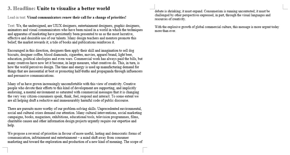
3. Unite to visualise a better world
Fig 1.3 Text of 'Unite to visualise a better world'
The text I choose is 'A code to build on and live by' which is the second one.
Visual References
I have found some healing and layout designs as references on Pinterest.
Fig 2.1 Visual references for headline and layout exploration
Sketches I came out with a few sketches using Procreate.
Fig 3.1 Sketches Week 5(11/5/2023)
- For the first sketch, I will be going to use 4 columns on a page.
- For the second sketch, I will be going to use 4 columns on a page.
- For the third sketch, I will be going to use 3 columns on a page.
Headline Expressions Exploration
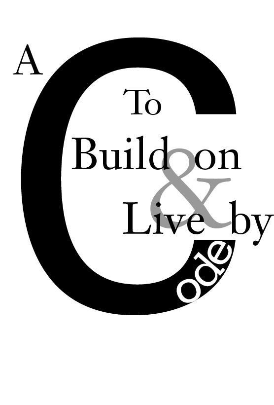
For my first headline, I am using a bigger black 'C' and putting white 'ode' in the black letter 'C' to make the expression on the word 'Code'. For this headline, I am using Adobe Illustration to make it.
Fig 4.1 Headline #1 Week 5(11/5/2023)
I also made two headlines using Adobe InDesign.based on my sketches.
Fig 4.2 Headline #2 and headline #3 Week 5(11/5/2023)
Layouts ExplorationFig 5.1 Layout #1 Week 5(11/5/2023)
HEAD
Font/s: Janson Text LT Std 55 Roman (A, To Build on & Live by), Univers LT Std 55 Roman (C), Serifa Std 55 Roman (ode)
Type Size/s: 85 pt (A), 70 pt (To), 90pt (Build on, Live by), 759 pt (C), 99 pt (ode), 230 pt (&)
BODY
Font/s: Adobe Caslon Pro Bold Italic (Lead in-text), Gill Sans Std Regular (body text)
Type Size/s: 24pt (Lead in-text), 9 pt (body text)
Leading: 11 pt (body text)
Paragraph spacing: 11pt
Characters per-line: 64 characters
Alignment: left aligned
Margins: 4mm (top), 18mm (Bottom), 12.7mm (Inside, Outside)
Fig 5.2 Layout #2 Week 6(14/5/2023)
HEAD
Font/s: Gill Sans Std Regular
Type Size/s: 58 pt
BODY
Font/s: Janson Text LT Std 75 Bold (Lead in-text), Gill Sans Std Regular (boby text)
Type Size/s: 22 pt (Lead in-text), 8pt (body text)
Leading: 12pt (body text)
Paragraph spacing: 12 pt (body text)
Characters per-line: 47 characters
Alignment: left aligned
Margins: 13mm (top, buttom, inside, outside)
Fig 5.3 Layout #3 Week 6(14/5/2023)
HEAD
Font/s: Gill Sans Std Regular ( Grey A Code To Build On And Live By),Gill Sans Std Bold ( Black A Code To Build On And Live By)
Type Size/s: 39 pt
BODY
Font/s: Futura Std Heavy (Lead in-text), Gill Sans Std Regular (body text)
Type Size/s: 18 pt (Lead in-text), 8 pt (body text)
Leading: 11 pt (body text)
Paragraph spacing: 11pt (body text)
Characters per-line: 47 characters
Alignment: left aligned
Margins: 10mm (top, buttom, inside, outside)
Final Editorial Layout
HEAD
Font/s: Gill Sans Std Regular ( Grey A Code To Build On And Live By),Gill Sans Std Bold ( Black A Code To Build On And Live By)
Type Size/s: 39 pt
BODY
Font/s: Futura Std Heavy (Lead in-text), Gill Sans Std Regular (body text)
Type Size/s: 18 pt (Lead in-text), 8 pt (body text)
Leading: 11 pt (body text)
Paragraph spacing: 11pt (body text)
Characters per-line: 29 characters
Alignment: left aligned
Margins: 10mm (top, buttom, inside, outside)
Fig 6.1 Final layout (JPEG, without baseline grids) Week 6 (16/5/2023)
Fig 6.2 Final Layout (PDF,without baseline grids) Week 6 (16/5/2023)
Fig 6.3 Final Layout (JPEG, with baseline grids) Week 6
(16/5/2023)
Fig 6.4 Final Layout (PDF, with baseline grids) Week 6 (16/5/2023)
FEEDBACK
Week 6
General Feedback
Can just focus in one part either in layout or the healine expression in our level
Specific Feedback
Week 7
General Feedback
Makesure update E-portfolio
Specific Feedback
Don't put anything out of the margin line
REFLECTION
Observations
During Task 2 of my typographic journey, I made several observations that greatly enhanced my understanding of typography. Firstly, I noticed the importance of exploring various design options. By experimenting with different layouts, font choices, and compositions, I was able to witness the impact of each element on the overall aesthetic and readability of the text. This process helped me recognize the significance of thoughtful typographic decisions in conveying a clear and engaging message.
Experiences
Engaging in Task 2 provided me with valuable experiences that expanded my knowledge and skills in typography. One of the key experiences was working with Adobe InDesign, a powerful tool for typographic expression. As I delved deeper into the assignment, I familiarized myself with InDesign's interface, discovering its extensive range of features and functions. This hands-on experience enabled me to manipulate typographic elements effectively and create visually pleasing compositions. It was gratifying to witness my design concepts come to life and witness the impact of typographic choices on the overall design.
Findings
Through this assignment, I made several significant findings regarding the technical aspects of typography. Firstly, I gained a deeper understanding of kerning, leading, and tracking and their role in achieving visual harmony. I discovered that subtle adjustments in these parameters can greatly impact the legibility and aesthetics of the text. Additionally, I found that utilizing typographic tools in InDesign, such as paragraph styles and character styles, not only improved workflow efficiency but also ensured consistency throughout the design.
FURTHER READING
Fig7.1 Typographic Design Form Communication
"Typographic Design: Form and Communication" is a comprehensive book written by Rob Carter, Philip B. Meggs, and Ben Day, which explores the fundamental principles and practices of typography in visual communication. The book provides a thorough understanding of the role typography plays in design, covering topics such as type history, anatomy, classification, and application.
The authors delve into the principles of visual hierarchy, emphasizing the importance of effective organization and layout in conveying messages. They explore various techniques for creating typographic compositions, including the use of grids, spacing, and proportion, to establish a harmonious and visually appealing design.
"Typographic Design: Form and Communication" also delves into the expressive potential of typefaces and their ability to evoke emotions and convey meaning. The book discusses different type families and their characteristics, allowing readers to make informed decisions when selecting fonts for specific design purposes.
Furthermore, the book delves into the practical aspects of typography, addressing topics such as legibility, readability, and accessibility. It offers insights into the technical considerations of typography, including letter spacing, line length, and typographic systems for different mediums.
The authors also highlight the historical and cultural contexts that have shaped typography, providing readers with a broader perspective on its evolution and significance in visual communication.
Overall, "Typographic Design: Form and Communication" serves as a valuable resource for anyone interested in the art and science of typography. By exploring the principles, techniques, and historical context of typography, the book equips readers with the knowledge and skills necessary to create impactful and visually compelling designs.


.jpg)
.jpg)


Comments
Post a Comment